Summohith
New member
Hi everyone!
My name is Mohit, and I’m excited to begin my journey as a contributor to the Talawa ecosystem for GSoC 2026.
I’ve been diving into the talawa-admin codebase and identified a UI bug in the shared-components/Auth/PasswordField component. Specifically, the visibility toggle icon was sitting outside the input field due to the Input Group structure, which also caused text overflow issues.
I have implemented a fix with the following approach:
Best regards, Mohit
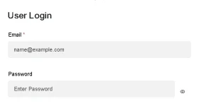
My name is Mohit, and I’m excited to begin my journey as a contributor to the Talawa ecosystem for GSoC 2026.
I’ve been diving into the talawa-admin codebase and identified a UI bug in the shared-components/Auth/PasswordField component. Specifically, the visibility toggle icon was sitting outside the input field due to the Input Group structure, which also caused text overflow issues.
I have implemented a fix with the following approach:
- Created PasswordField.module.css to handle scoped styling.
- Wrapped the input and button in a position: relative container.
- Used absolute positioning to center the toggle icon vertically and added right-side padding to the input to prevent text from overlapping the icon.
- Verified that all existing tests in PasswordField.spec.tsx still pass.
Best regards, Mohit